Dry Ager was a high-end, niche product that many consumers found intimidating or confusing.Dealers also struggled to explain its value and usage clearly, which led to weak consumer engagement and limited brand understanding.
I repositioned the product from a “technical appliance” to a lifestyle-enhancing experience through multi-channel content:
The entire design direction avoided traditional corporate materials and embraced a more relatable, modern, and editorial feel.
Creative strategy / Campaign Design / Copy Direction / Layout Execution / Multi-channel Adaptation


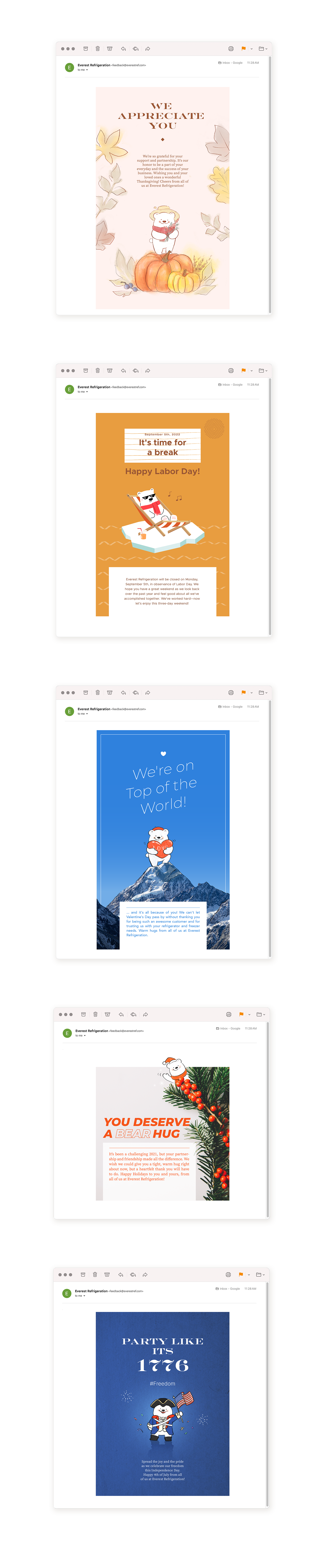
The brand’s polar bear icon felt generic, lacked personality, and unintentionally resembled Coca-Cola’s mascot—weakening distinctiveness and emotional connection with the audience.
I reimagined the bear as a more expressive, brand-aligned character with a softer face and friendlier tone. Instead of forcing it through marketing, I introduced the redesign via a seasonal holiday email—free from sales language, just an honest thank-you to customers.
Key elements:
The campaign struck a strong emotional chord—customers praised its sincerity and originality.
The bear evolved into a recurring brand symbol, later adopted across product visuals, internal assets, and seasonal content.
What started as a one-off email became a lasting part of the brand’s identity.
Character redesign / Illustration / Email content design / Creative direction